OCTOPUS GIRL painting with handmade watercolors
Painting and playing with color always been my thing. Although trying out different watercolor papers led me to experimenting and seeing what happens to the color and how it reacts on different papers. I noticed that sometimes the paints sort of really sink into the paper. Which makes it really easy to blend, but harder to lift. It all depends, of course, on the percentage of cotton and additives in the paper. At the same time I have lots of fun painting even on kids' paper that is half acrylic and is made with recycled materials. The color tends to stay more on the surface than sink on those types of paper creating interesting and unpredictable results. Have you ever experienced this?
But, no matter which paper I use, expensive or cheap, what I do require from my paints - is the reliability and knowing what to expect. Most importantly, the joy that I receive when painting with my favorite paints. I don't want to rub and rub and rub into the color and wait until it releases from the binder. I guess, what I am trying to say is that all this time I have been making my handmade watercolors, I still get goosebumps from watching my paints flow and mingle on paper. It makes me proud and happy to make the colors that I myself enjoy using.
Today I would like to share with you my inspiration I received from these few colors when creating this illustration, the Octopus Girl.

This illustration was made using mostly 4-6 paints, Soft shimmer pale rose, Earthy red, Hazy grey purple, Pink and Lavender. I used a layering technique which is not exactly my "signature" style. I am more of a spontaneous painter. I love to throw a lot of color on the page and see what happens.
This time, I added layers, one by one, watching the colors flow, observing the shimmer versus matt pigment distribution and making my further color decisions as I went on painting.


But, no matter which paper I use, expensive or cheap, what I do require from my paints - is the reliability and knowing what to expect. Most importantly, the joy that I receive when painting with my favorite paints. I don't want to rub and rub and rub into the color and wait until it releases from the binder. I guess, what I am trying to say is that all this time I have been making my handmade watercolors, I still get goosebumps from watching my paints flow and mingle on paper. It makes me proud and happy to make the colors that I myself enjoy using.
Today I would like to share with you my inspiration I received from these few colors when creating this illustration, the Octopus Girl.
OCTOPUS GIRL. Arches, Cold Press paper.
This illustration was made using mostly 4-6 paints, Soft shimmer pale rose, Earthy red, Hazy grey purple, Pink and Lavender. I used a layering technique which is not exactly my "signature" style. I am more of a spontaneous painter. I love to throw a lot of color on the page and see what happens.
This time, I added layers, one by one, watching the colors flow, observing the shimmer versus matt pigment distribution and making my further color decisions as I went on painting.
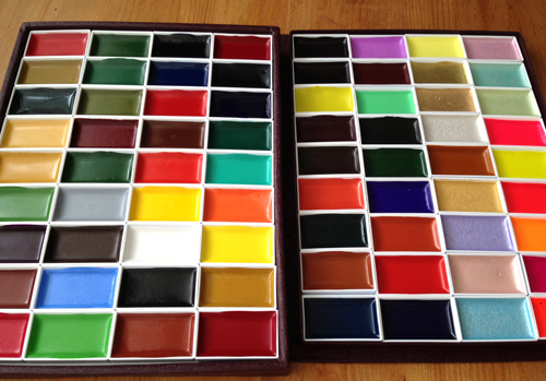
Bellow you can see additional colors that can be used
depending if you are interested
in taking the color scheme towards the Red or Purple Blue.
depending if you are interested
in taking the color scheme towards the Red or Purple Blue.
The two palettes listed above both contain 5 colors I mentioned, plus additional DECADENT RED. I added ULTRAMARINE BLUE to the larger palette to extend the color combo.
Imagine adding a touch of blue to her shadow and pupils of her eyes. Sometimes, just a splash of familiar color can take the painting to completely new direction.
Please check out these palettes and see if you would like to create your own composition using this color palette. (The original OCTOPUS GIRL painting is also available for sale.)Imagine adding a touch of blue to her shadow and pupils of her eyes. Sometimes, just a splash of familiar color can take the painting to completely new direction.

This above is a 6-piece set with half pans

This one is a 7-color set, full pans
Comments
Post a Comment